Hi all,
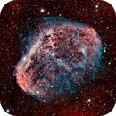
if you have some time could you pls check my image attached? I would not add any further comments here what to check not to influnece you. I'm asking becuase I got already some reviews from other astrophotographers and they were either very postive or very negative, nothing in between and I dont fully understand why. Maybe if I get some more reviews here from you as neutral party I can understand better what is bood or bad on this processing.
 |
You cannot like this item. Reason: "ANONYMOUS".
You cannot remove your like from this item.
Editing a post is only allowed within 24 hours after creating it.
You cannot Like this post because the topic is closed.
I think you got some very positive and some very negative reviews because this image has something good and something bad going on for it.
The good is how well you managed to highlight the OIII gases.
The bad is that you used way too much deconvolution in an attempt to increase the level of detail, and that generated some artifacts.
Regarding colors, I think I would use something like this as reference, and see if you manage to get there:
Hope this helps!
Salvatore
|
You cannot like this item. Reason: "ANONYMOUS".
You cannot remove your like from this item.
Editing a post is only allowed within 24 hours after creating it.
You cannot Like this post because the topic is closed.
|
Thanks a lot Salvatore it helps!
|
You cannot like this item. Reason: "ANONYMOUS".
You cannot remove your like from this item.
Editing a post is only allowed within 24 hours after creating it.
You cannot Like this post because the topic is closed.
|
False colors in a narrowband image are still false colors. For me it's a matter of taste.
|
You cannot like this item. Reason: "ANONYMOUS".
You cannot remove your like from this item.
Editing a post is only allowed within 24 hours after creating it.
You cannot Like this post because the topic is closed.
In addition to Salvatores opinion, which i confirm, i see that the backgrond is a bit so soft compared to the NGC6888 itself.
The brighter stars a a bit to expanded.
The reason for different comments may be the individual taste of everybody.
Dont be disappointed about it.
|
You cannot like this item. Reason: "ANONYMOUS".
You cannot remove your like from this item.
Editing a post is only allowed within 24 hours after creating it.
You cannot Like this post because the topic is closed.
Thanks Klaus and Carl0s for your attention.
Regarding the deconv, I knew I applied a big amount in the begging, I just did not know whether it is good or bed, I liked the result  , but I will take back in the next version, now I understand that it is not fully correct. , but I will take back in the next version, now I understand that it is not fully correct.
Regarding the colors, I applied the color which was determined by Pixinsight automatically, so I will leave as is, I think in narrowband there is more freedom in this topic.
Regarding star shape, I could reduce size of the mentioned stars, this is likely because of the blooming on bin2, so somehow it is normal.
|
You cannot like this item. Reason: "ANONYMOUS".
You cannot remove your like from this item.
Editing a post is only allowed within 24 hours after creating it.
You cannot Like this post because the topic is closed.
The good thing is you are getting a lot of resolution. Congrats on you guiding. You are trying to accentuate that resolution with more local contrast. The problem is by doing so you are trading away your S/N, and things are getting noisy. If you look at the good photos of the Crescent Nebula you will find that most people have on the order of 16 or more hours of integration time. I think that more time is what you need the most, and then the heavy deconv will work.
Your treatment is also non-standard, and lots of people judge things by what they are accustom to. You are using less saturation than many people do, and you color balance is on the cool side. I think that it would work if you had less of the distracting noise. Sometimes saturation is used to distract people from seeing lack of detail by blinding them with bright colors. When someone looks at your picture I think one gets cognitive dissonance trying to process in their minds what is the fine detail (signal) and what is just grain (noise). It makes one fatigued to look at your picture for very long. When using low saturation and fine detail, you need more dynamic range to help people sort things out. Once again the need is for more integration time. I for one like different treatments. I think your experiment is in the right direction for something good, but different.
|
You cannot like this item. Reason: "ANONYMOUS".
You cannot remove your like from this item.
Editing a post is only allowed within 24 hours after creating it.
You cannot Like this post because the topic is closed.
Before i begin it is a nice image with great detail and data. Only offering feedback as you have asked.....
Agree with Salva that colour could do with a tweak, for me the provided example is a little muddy in terms of background colour. I tend to be a bit me free with my colouring but this version shows what can be done. http://www.astrobin.com/full/254474/0/?nc=user
If you get the detail more red in colour it will create more contrast against the blue OIII data, be sure not to loose this in the process. If you retain you difference between the background will increase and you will find that you can amplify it more as easier to select that local colour range.
In terms of detail it is very good but wonder if it could be better? The adjustments (sharpening/LHE etc?) may be a little course causing the filaments to 'clump' a little. More smaller changes rather than fewer larger ones.
You are talking about tweaks here to the process not wholesale changes.
Hope that helps
Paddy
|
You cannot like this item. Reason: "ANONYMOUS".
You cannot remove your like from this item.
Editing a post is only allowed within 24 hours after creating it.
You cannot Like this post because the topic is closed.
Hi Gilbert, Paddy, thanks a lot for your advices. I guess you are right with the more expo and also with the adjustment of the sharpening process more smoothly, I will try as you suggested.
Br, Peter
|
You cannot like this item. Reason: "ANONYMOUS".
You cannot remove your like from this item.
Editing a post is only allowed within 24 hours after creating it.
You cannot Like this post because the topic is closed.
to create to post a reply.


