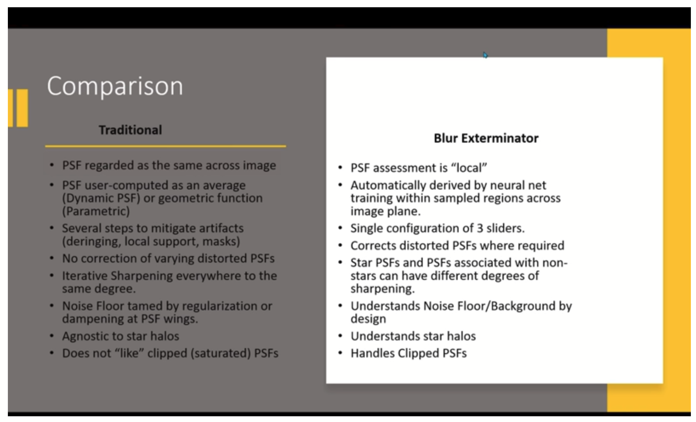
Hey guys here Adam Block dissects PSF in BlurX in detail... done regionally/locally is the Bottom Line Up Forward (BLUF):
https://www.youtube.com/watch?v=_rWEuW4MTrQ |
You cannot like this item. Reason: "ANONYMOUS".
You cannot remove your like from this item.
Editing a post is only allowed within 24 hours after creating it.
You cannot Like this post because the topic is closed.
Hi Jerry,
Thanks for the information, but please - I don't understand your point in posting that here. Don't get me wrong, I do use and enjoy using BlurX and NoiseX, but I am not sure I get the point you are making with respect to GHS.
This is supposed to be a forum on GHS - a FREE utility. Please remember, Mike and I receive NO FUNDING for the development of GHS nor for its support. GHS is a hobby to us, and we dedicated our time and work solely to help other enjoy this hobby. In our minds this hobby is expensive enough as it is, and we didn't want to create something where cost would be a potential barrier to its use. This is also why Mike and I whole heartedly backed and helped with the implementation of GHS into Siril (a world class and free astronomical image processing utility).
I totally get that there are paid utilities and paid instruction out there and I have nothing against that (I am in business myself after all - just not astrophotography). Personally, I also enjoy Adam's videos, find them top notch and he does provide a lot of material free of charge.
It's just that what you are posting has very little to do with GHS and I strongly suggest that you create another forum topic dealing with this topic. I don't want anyone to think that in order to use GHS, one has to pay for these other services, nor feel that they are missing out on a great hobby by not doing so.
There is huge value and integrity to images that are honest observations and less prettified by stuff made up by AI to fit someone else's interpretation. For example, I may want my dark nebula to fade to black, not jump to absolute black (something I found an issue). I may also want the freedom to sacrifice aesthetics to make a salient astronomical points more visible. These are things that GHS was meant to do, in addition to making images reflect standardized "beauty".
Cheers,
Dave
|
You cannot like this item. Reason: "ANONYMOUS".
You cannot remove your like from this item.
Editing a post is only allowed within 24 hours after creating it.
You cannot Like this post because the topic is closed.
Just a short note to say thank you so much Dave & Mike for GHS. It's brilliant and has become a fundamental part of my processing flow. This thread has also been v useful in picking up tips on how to best use it (eg: no need to use linear fit for the blackpoint, the RGB vs Col trick etc). I find running GHS separately on starless and star images and then recombining really allows me to play with the aesthetics w more granularity than I had ever figured out how to do before in the pre-GHS days (an example here).
And all this as a free utility - thank you, that is an incredibly generous thing to have done. I'm reminded of the free open source contribution by the builder of Astrohopper as another example.
Bravo!
Vin
(PS - have you ever thought of allowing voluntary payments as done by Autostakkert and others?)
|
You cannot like this item. Reason: "ANONYMOUS".
You cannot remove your like from this item.
Editing a post is only allowed within 24 hours after creating it.
You cannot Like this post because the topic is closed.
Yeah, would second that... maybe buy the guys a cup of coffee via PayPal?
I have been in the swamp here for months and finally got so fed up I processed this image with GHS:

This is the HA used in the final color image both for color and L, but you lose the detail, which is there because of GHS.

Sh2 80 Ring Nebula Surounding Wolf Rayet star WR 124 |
You cannot like this item. Reason: "ANONYMOUS".
You cannot remove your like from this item.
Editing a post is only allowed within 24 hours after creating it.
You cannot Like this post because the topic is closed.
Thanks Leela and Jerry,
Leela, your image is very well done. And Jerry, your image is great too, but I though you were in sunny California. Nothing but clear skies for us north of you.
Here's a couple of additional tricks & tip you may want to try (just off the top of my head).
1) If you want to repair stars that aren't clipped, but overbrightened, set SP to 1.0, b to 15, and stretch fairly hard. This will darken the whole image, but if you then move LP all the way up to 0.9 or so, then will reduce the darkening of most of the image, mainly resulting in the star repair.
2) If I am using the colour option, I always err on the side of not enough saturation. Then when you are almost finished, use GHS to do a stretch on the saturation itself. For this, set b to -1.5 to -2.0 and GHS will behave like an arcsinh stretch - perfect for stretching saturation. Adjust to taste, being careful not to oversaturate the bright stuff. Even if you don't use the colour option at all, this is still a good technique to add saturation - but be careful, saturation stretches can clip.
3) To dim or brighten stars when adding/blending to a starless image, first stretch the starless image (brighten it to dim stars, darken to lighten stars) and iconify the GHS instance - then add/blend the stars and perform the same stretch (same inputs) as before only selecting the invert box to perform the inverse stretch on the now starry image. This will restore your nebulosity to where it was before, but now the stars will be brighter or darker.
4) If you use HDRMT and/or LHE, visit your image with GHS after these steps. It is helpful to use GHS to make some fine adjustments to anything undesirable to the image/histogram (unintended consequences) that these processes might have done.
One thing I make use of now and again, is the invert option, where you use SP to take contrast away from a certain point, rather than increase it. If you haven't used it, it is worth a try.
Speaking for Mike as well (I think he is on vacation), it was our pleasure to create GHS, and help the Cyril and Adrienne put the functionality in Siril. They have been taking GHS a step further and making it a part of additional, really interesting, processes and utilities.
I actually take a lot of pride in that it was a free utility - this endeavour is expensive enough. Coming from a different field and where the GHS equations are widely used in time series forecasting, I saw quite quickly an application to image stretching. They just needed a slightly different formulation. Mike did a lot of the work in programming it up and made a great interface for it. His skills are second to none.
Speaking of which, Mike has teamed up with @Bill Blanshan putting scripts together for interfaces to Bill's Pixelmath expressions. They, along with some other scripts Mike as put together can be found at Cosmic Photons – Astrophotography. I am keen to try them out myself.
Anyways, glad you like GHS and thanks again for the feedback.
CS
Dave
|
You cannot like this item. Reason: "ANONYMOUS".
You cannot remove your like from this item.
Editing a post is only allowed within 24 hours after creating it.
You cannot Like this post because the topic is closed.
Hey Guys... appreciate this is a labor of love... you should see the programming I have done with little recompense. I think if you do astrophotography software you better not quite your day job or be retired.
Lotsa fog and few images but I have a bit of a question. I just put this image up and could not master the right side of the histogram. This is a comment response to Gary Imm:
... The GHS allows you to make the most of the subtle greyscale variations. I had one problem with the GHS that I need to bring up with the developers... have mastered getting the histogram to the left but I am having problems optimizing the right (bright) side.
Cannot seem to stretch this out without blowing out the brights....
Am I missing a trick here????

Sh2 93 (Two Acquisitions Contrasted) |
You cannot like this item. Reason: "ANONYMOUS".
You cannot remove your like from this item.
Editing a post is only allowed within 24 hours after creating it.
You cannot Like this post because the topic is closed.
Hi Jerry,
I would put SP on the far right of the histogrom - right where is starts to fall off a cliff downwards - Just to the left of the straight cliff, but after it bends downwards towards the cliff - if that makes sense. In this case I would start with a b of say 2-4. When you apply D - stretch amount, you will see it darken the image, but lessen the cliff - this will add contrast in the brightest part of the nebula. So at first, concentrate on getting the amount of contrast here to roughly where you want it - by playing with D, b, and SP.
This will darken the rest of the image, which is something you don't want to do too much, so the next step is to move LP upwards towards SP, which will brighten the image again - and you may have to apply more D. Overall get the histogram profile right.
For overall final brightness adjustments, I usually apply a b<0 with SP at 1 or 0 (or even an inverse GHS). This value of b tends to leave the histogram profile more or less intact and just controls the brightness more than anything else.
I hope this makes sense and let me know how you get on.
Cheers,
Dave
|
You cannot like this item. Reason: "ANONYMOUS".
You cannot remove your like from this item.
Editing a post is only allowed within 24 hours after creating it.
You cannot Like this post because the topic is closed.
Well, have been playing around a lot with that histogram and here is another greyscale. This one needed work more on the other side in the darks.
If poor old Ansel Adams had only had these tools who knows what he would have done.

Sh2 99 and 100 and LBN 158 |
You cannot like this item. Reason: "ANONYMOUS".
You cannot remove your like from this item.
Editing a post is only allowed within 24 hours after creating it.
You cannot Like this post because the topic is closed.
One more with the careful stretching of the greyscale. I have to read more on the theory. I need a step-by-step procedure, but I find I have to go by my eye a lot.

Sh2 106 (AKA Snow Angel Nebula) |
You cannot like this item. Reason: "ANONYMOUS".
You cannot remove your like from this item.
Editing a post is only allowed within 24 hours after creating it.
You cannot Like this post because the topic is closed.
Hi,
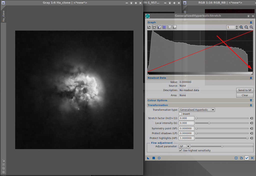
AM back with another tricky GHS problem. I have this very dull PN that I am trying to bring out. This is 8h of H-alpha and O-III. This is my initial setting and the arrow is where I selected the SP:
You can just barely see the PN. But it is there and I wonder should I manipulate the SP first and then b, or vice versa or does it matter and it is just artistry.
Here is what I get with the changes made... maybe just needs more exposure and is very dull?

Here is the second stretch, I think you can see what I am trying to bring out... these are cool objects... never thought I would see the detail at this scale. A mask cleans up the background stuff.

This is the work in progress.

Planetary Nebula G1296+034 |
You cannot like this item. Reason: "ANONYMOUS".
You cannot remove your like from this item.
Editing a post is only allowed within 24 hours after creating it.
You cannot Like this post because the topic is closed.
Thanks for the post Jerry, and great capture.
As for using GHS, it just takes a little getting used to. I would go back and forth on b, SP, and even D. Just my initial thoughts from the settings - I would try and even larger b (put it to 15 to start), and then move SP a little to the left. This will help darken the background, yet bring out more of the dim stuff and contrast it against the background. Once this is set, you may want to back off b somewhat.
The other hint that I would give is to remember, you don't have to do the full stretch in one go. On your last image, you have the whole RHS of the histogram plot to work with.
Hope that helps, but everyone seems to come up with their own style and methodology.
CS
Dave
|
You cannot like this item. Reason: "ANONYMOUS".
You cannot remove your like from this item.
Editing a post is only allowed within 24 hours after creating it.
You cannot Like this post because the topic is closed.
Thanks, one of the videos has these D=7 and b=3 settings, but I should try the 15 on the b. I know the signal is there, but it is question of how to bring out the contrast. Of course, this particular one needs more time. In my write up the best images uses 85h! It is easy to add artifact when the signal is dim. I also have the Oyster in the hopper and that is so bright you can do no wrong.
Edit:
I used the new approach to "The Oyster" and I think it turned out well: Very tricky and helps to go slow with multiple passes.

NGC 1501 Oyster Nebula |
You cannot like this item. Reason: "ANONYMOUS".
You cannot remove your like from this item.
Editing a post is only allowed within 24 hours after creating it.
You cannot Like this post because the topic is closed.
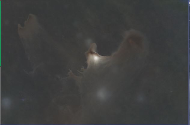
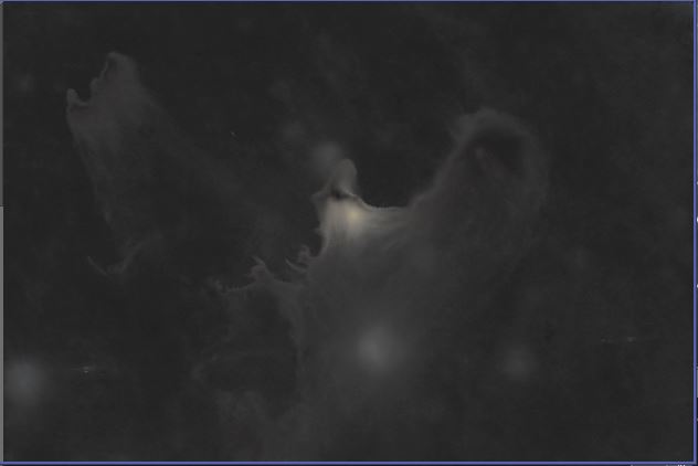
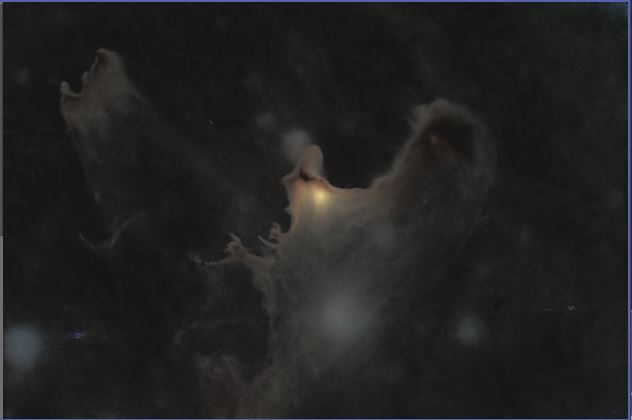
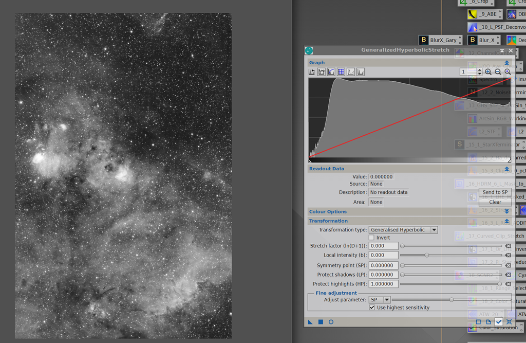
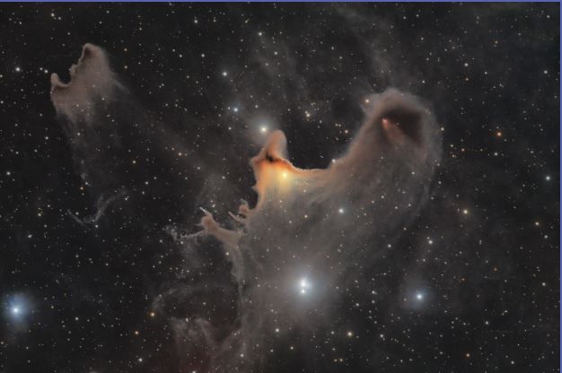
Been using GHS for a bit now, long enough that I'm starting to wonder how I made do without it!..... : ) In addition to the increased control it allows, I've found that between the RGB and Colo(u)r modes and the blend slider, GHS preserves saturation better than any other tool I've used. For the most part, after stretching little additional color adjustment is necessary. That said, I'm working on the Ghost Nebula right now and, color-wise, the stretch didn't go as expected. Before I was half done, using either the RGB or Colour mode, the RGB image looked nearly gray-scale. Far less color, even, than the auto screen stretch. As I write this, I realize I probably could have used the Saturation mode along the way, but I've not played with that much, so did the first couple iterations with the Arcsinh transformation type instead and then switched to the GHS type for the rest. In the end it worked out, though more color tweaking after than I usually need to do, but I'm curious why the Colour/RGB modes de-saturated the image so much in this case.
The images below are the auto-screen stretch, Colour mode stretch (not finished), arcsinh/ghs transformation type (ghs in colour mode) stretch, and final image.
Cheers,
Scott


 |
You cannot like this item. Reason: "ANONYMOUS".
You cannot remove your like from this item.
Editing a post is only allowed within 24 hours after creating it.
You cannot Like this post because the topic is closed.
Hi Scott
That's a great final image!
To try to answer your question I think I would need to look at the data you are using. If you are happy to share that I will take a look and see if I can work out what's happening.
CS. Mike
|
You cannot like this item. Reason: "ANONYMOUS".
You cannot remove your like from this item.
Editing a post is only allowed within 24 hours after creating it.
You cannot Like this post because the topic is closed.
Thanks Mike! Here's a link to the RGB master I was working on.
https://drive.google.com/drive/folders/1_W77ec7kh9U1Jhu1vXZDkdMgUXzhceV3?usp=drive_link
The individual channels are 1x drizzled and run through GraXpert (the gradient was very light). The RGB has been processed with SPCC and BlurX, stars removed with StarX, and rotated. Happy to provide the R, G, and B masters with or without GX, but I'm a bit out in the boonies with slow internet, so thought I'd ask what you want first.
Cheers,
Scott
|
You cannot like this item. Reason: "ANONYMOUS".
You cannot remove your like from this item.
Editing a post is only allowed within 24 hours after creating it.
You cannot Like this post because the topic is closed.
|
Very interesting on the color and will follow that discussion in detail. Black science for me. When Istarted out with GHS under the influence of the videos I tried using the color stretch first but it was just too strong so went back to RGB but added saturation at the second step. Star color got out of control.
|
You cannot like this item. Reason: "ANONYMOUS".
You cannot remove your like from this item.
Editing a post is only allowed within 24 hours after creating it.
You cannot Like this post because the topic is closed.
Jerry Yesavage:
Very interesting on the color and will follow that discussion in detail. Black science for me. When Istarted out with GHS under the influence of the videos I tried using the color stretch first but it was just too strong so went back to RGB but added saturation at the second step. Star color got out of control.
Sometimes Colour mode is too saturated for me too, but you can always use the Colour Blend slider to bring it all the way back to RGB, or anything in between. There are also times when I see little to no difference between RGB and Colour, and even a couple times where RGB was the more saturated.
Cheers,
Scott
|
You cannot like this item. Reason: "ANONYMOUS".
You cannot remove your like from this item.
Editing a post is only allowed within 24 hours after creating it.
You cannot Like this post because the topic is closed.
Yeah, I am playing around with some stars this AM on K 1-2... very dim PN and you can get to colors OK with RGB+Saturation. I have gotten into using Bill B star reduction script to reduce some halos. Stars get pretty small but they are colorful.
Having much more trouble bringing out dim structures in the PM, where the red arrow is.... best image on this is 40h cited in the work in progress at the bottom... and I am only at 9h. I may just need more time.... cannot make a pig fly!

Kohoutek 2-1 |
You cannot like this item. Reason: "ANONYMOUS".
You cannot remove your like from this item.
Editing a post is only allowed within 24 hours after creating it.
You cannot Like this post because the topic is closed.
Thanks for sharing your images Scott.
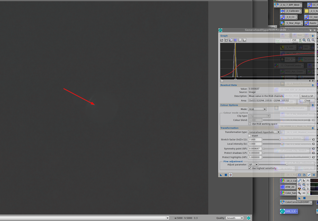
Let me start with some explanation of the difference between RGB and Colour stretch. Suppose we set the parameters (D, b, SP, LP, HP) so that the GHS transformation maps the value x -> GHS(x). Now let the red green and blue pixel values be r, g and b.
Under the RGB stretch the new pixel values will be GHS(r), GHS(g) and GHS(b).
Under the colour stretch we find the average sample value m = (r + g + b)/3. Then we find the ratio k = GHS(m)/m. And now the new pixel values will be k*r, k*g, k*b.
Now let's think about saturation. The greater the separation between the largest channel value and the lowest, the greater is the saturation. Under one definition of saturation this can be written mathematically as (<max channel value> - <min channel value>)/<max channel value>. let's fix ideas and suppose r>g>b, then the initial saturation before the values are stretched is (r - b)/r = 1 - (b/r).
Noting that the GHS transformation preserves the rank order of pixel values, the saturation after the stretch will be:
RGB stretch: 1 - GHS(b)/GHS(r)
Colour stretch: 1 - (k*b)/(k*r) = 1 - b/r
This demonstrates that the colour stretch leaves the saturation unchanged.
The RGB stretch, on the other hand, will usually change the saturation. Specifically if GHS(b)/b is greater than GHS(r)/r, saturation will reduce and vice versa.
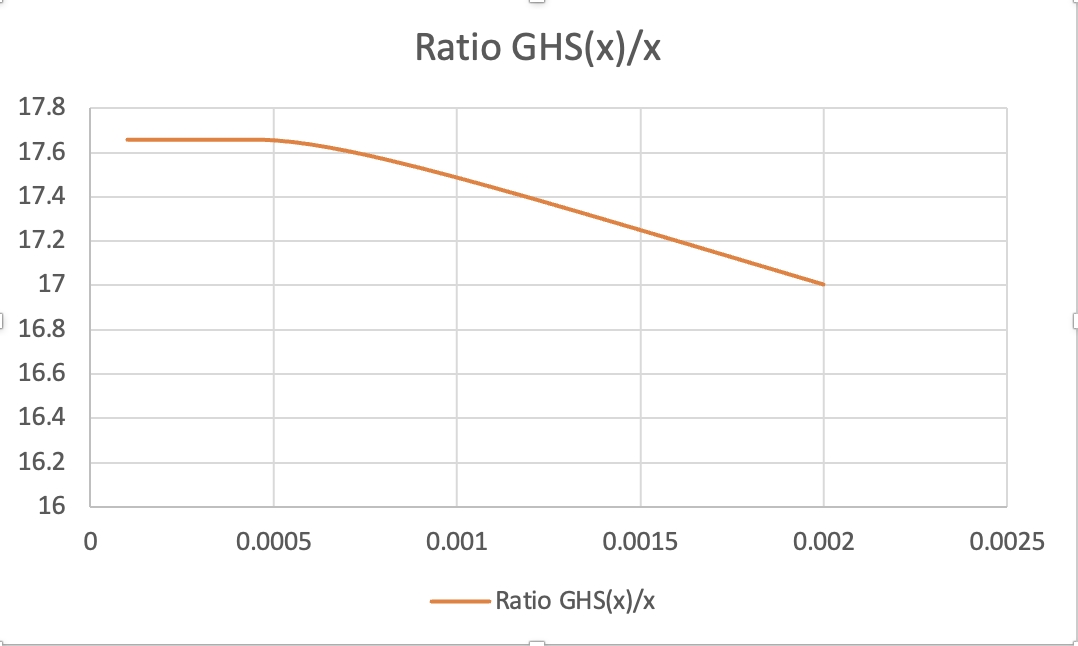
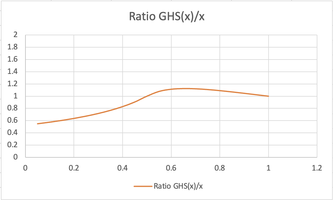
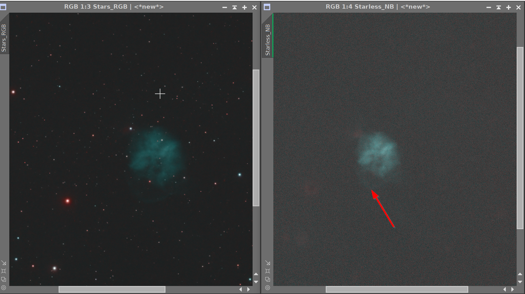
Now let's look at your image. With stars removed the histogram is very tight with almost all pixel values falling between 0.0004 and 0.0005. Furthermore if you look at the readouts of channel values at each pixel, the values in each channel are very close. In the chart below I graph GHS(X)/x against x for a sample initial stretch for this image (specifically: D=6, b=10, SP=0.00045, LP=0, HP=1).
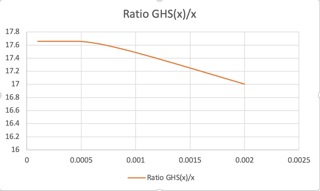
You will see that over the range of values covered by this image the ratio is pretty much constant. Hence, the Colour method and the RGB method will have very little difference in effect. In other images we will often see pixel values extending over a greater range and, in particular, extending into the area where the graph slopes down. In this area larger values are stretched less proportionately than smaller values and, from our previous analysis this means saturation will be lost. When this happens the Colour method will preserve saturation as you have seen in most of your images.
You also commented that sometimes you see the Colour method reducing saturation compared to the RGB method. Let's take a look at the GHS(x)/x graph for a different stretch, perhaps something you might use as a second or subsequent stretch (specifically: D=1, b=4, SP=0.5, LP=0, HP=1). The graph looks like this:

Clearly the relationship here is more complicated and the upward slope of this graph below c0.6 means that applying the RGB stretch to pixel values in this range will increase saturation compared to the Colour stretch.
In general the RGB method will reduce the saturation in the image for your initial stretch but this isn't necessarily the case in subsequent stretches.
This may be far more detail than you wanted but maybe it helps?
CS, Mike
|
You cannot like this item. Reason: "ANONYMOUS".
You cannot remove your like from this item.
Editing a post is only allowed within 24 hours after creating it.
You cannot Like this post because the topic is closed.
I want to say I am so grateful to everyone that dedicated their personal time to provide the AP community with these amazing free tools, and in this forum particularly, the folks behind GHS. Thank you.
|
You cannot like this item. Reason: "ANONYMOUS".
You cannot remove your like from this item.
Editing a post is only allowed within 24 hours after creating it.
You cannot Like this post because the topic is closed.
Ashraf AbuSara:
I want to say I am so grateful to everyone that dedicated their personal time to provide the AP community with these amazing free tools, and in this forum particularly, the folks behind GHS. Thank you.
I know I speak for both myself and Dave when I say we are very happy to have made a useful contribution towards a pastime from which we both derive great satisfaction. Our reward is principally the many fantastic images that people post that GHS has helped create, but it is also lovely to receive personal comments/thanks such as yours - thank you!
CS, Mike
|
You cannot like this item. Reason: "ANONYMOUS".
You cannot remove your like from this item.
Editing a post is only allowed within 24 hours after creating it.
You cannot Like this post because the topic is closed.
Jerry Yesavage:
Yeah, I am playing around with some stars this AM on K 1-2... very dim PN and you can get to colors OK with RGB+Saturation. I have gotten into using Bill B star reduction script to reduce some halos. Stars get pretty small but they are colorful.
Having much more trouble bringing out dim structures in the PM, where the red arrow is.... best image on this is 40h cited in the work in progress at the bottom... and I am only at 9h. I may just need more time.... cannot make a pig fly!
Kohoutek 2-1
Hi Jerry,
Lots of good work here.... I am really enjoying your postings
I have been experimenting a little bit on the extraction of lum to use to bring out dim features such as you describe. For many narrowband, most use either an extracted lum from an RGB image (minimizes noise by combining the most images) or the Ha channel, which, most often, has the strongest signal. We are free, however, to use whatever channel or linear combination we want. Since your object has the strongest signal in O3, i would process the grey scale O3 channel as if it were the luminance. Once I get my best "colour" non-linear version, and my best O3/lum non-linear version then I LRGB combine them. This will make the dim O3 nebulosity stand out from the whiter background.
So when picking a luminance to process, I often look at the dim features and their signal stretch. In general I do a linear combination of an extracted RGB lum, and the individual colour channels to get the best SNR I can while emphasizing the features I want. In this case, maybe 50% elum + 50% O3?
Also, on saturation, if you are dimming - saturation will be reduced using the colour option. Often I use a muted colour option when stretching RGB, or not at all for NB and opt for a saturation stretch instead. This is best accomplished with a -ve b (shaped like an arcsinh stretch). If you imagine a right angle triangle in your histogram plot with its apex at 0.5 and corners at (0,0), (0.5,1) and (1,0), the right side of the triangle, sloping down from 0.5,1 to 1,0 represents a "do not cross" line when stretching saturation.
Hope this helps.
Dave
|
You cannot like this item. Reason: "ANONYMOUS".
You cannot remove your like from this item.
Editing a post is only allowed within 24 hours after creating it.
You cannot Like this post because the topic is closed.
Scott Badger:
Jerry Yesavage:
Very interesting on the color and will follow that discussion in detail. Black science for me. When Istarted out with GHS under the influence of the videos I tried using the color stretch first but it was just too strong so went back to RGB but added saturation at the second step. Star color got out of control.
Sometimes Colour mode is too saturated for me too, but you can always use the Colour Blend slider to bring it all the way back to RGB, or anything in between. There are also times when I see little to no difference between RGB and Colour, and even a couple times where RGB was the more saturated.
Cheers,
Scott
Great image Scott, thanks for sharing
|
You cannot like this item. Reason: "ANONYMOUS".
You cannot remove your like from this item.
Editing a post is only allowed within 24 hours after creating it.
You cannot Like this post because the topic is closed.
Ashraf AbuSara:
I want to say I am so grateful to everyone that dedicated their personal time to provide the AP community with these amazing free tools, and in this forum particularly, the folks behind GHS. Thank you.
What Mike said. Glad you enjoy.
|
You cannot like this item. Reason: "ANONYMOUS".
You cannot remove your like from this item.
Editing a post is only allowed within 24 hours after creating it.
You cannot Like this post because the topic is closed.
Ditto to Ashraf's comments! And thanks Dave!
Mike, the math and your explanation are VERY welcome -- thanks!
So, if the lack saturation using the Colour mode (which preserves saturation) is due to the generally low pixel values overall, and the minimal spread between high and low for the different channels, is that expected of this target, and therefore my final image (as well as most other published images) is technically oversaturated?
Assuming there should be more native saturation, I wondered if any of my processing was responsible for flattening it. I thought maybe using GraXpert on the individual channels, or NoiseX on the RGB while still linear, so I picked a single pixel, one of the more 'colorful' in my final image, and followed it through the processing.
- Drizzling decreased the channel values by about 20%, but increased the high/low ratio by 5%.
- GraXpert significantly elevated the values of each channel (about 25%) but the ratio between high (red) and low (blue) remained the same.
- The biggest change in ratio occurred with the application of SPCC, but that would be expected, right? Before SPCC, there was a 32% difference between red and blue and after it was 16%.
- NoiseX (after combining) had some effect, about a 4% decrease in the high/low ratio between before and after.
I guess I don't see anything to point my finger at processing-wise, so is there something about the data itself that results in less saturation than expected, or again, is the little saturation in my data normal for this target?
Cheers,
Scott
Edit: Forgot to include BlurX, but it caused no significant change in the sample pixel values.
|
You cannot like this item. Reason: "ANONYMOUS".
You cannot remove your like from this item.
Editing a post is only allowed within 24 hours after creating it.
You cannot Like this post because the topic is closed.
to create to post a reply.